Project Overview
AthleteX is a peer-to-peer platform for discovering in-person sports activities anytime, anywhere. Users can explore, share, and invite friends to join them in creating unforgettable memories through the joy of sports. What sets AthleteX apart is the ability for users to effortlessly create and share their own sports activities with others.
Business Goals
- Establish a user-friendly website to enable easy discovery and access to various sports activities from any location.
- Empower users to create their own sports activities effortlessly.
- Encourage user engagement by providing convenient navigation, and motivating both sharing and attendance of activities.

Target Users
*Individuals seeking diverse sports activities to join
*People interested in broadening their social circles through sports-related interactions
Athletes looking to create and share their activities with others
**We concentrated on designing the website for the first two target groups.
DISCOVER
Let’s Uncover the Journey to the Final Design
To understand the users' pain points and develop effective solutions, we employed a comprehensive research approach that consisted of the following methods: Competitive Analysis, Online Survey, Interview
What Do Our Direct and Indirect Competitors Do?
In the initial phase, we started by identifying sports websites with similar objectives to gain a clearer understanding of the essential features of our design. We conducted a thorough analysis of these platforms to grasp their overall structure and functionalities, providing valuable insights for our own design process.
Additionally, we expanded our scope to include platforms like Airbnb and Meetup, recognizing that their designs could also inform the development of our website. By examining these diverse platforms, we ensured that our design encompasses all the necessary elements to deliver a seamless and engaging user experience.
***we outlined the key aspects that influenced our design.
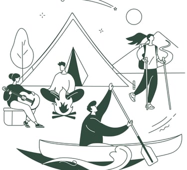
- Hike & bike activities
- Profile page Layout
- Following members
- Sharing activities
- Applying search filters
- All kind of events
- Making groups and events
- Sharing activities
- Adding events to calendar
- Chatting with members
- All kinds of events
- Following members
- Finding & creating events
- Checking Similar events suggestion
- Outdoor activities like hike
- Searching with advanced filters
- Searching activities on the map
- Following members
- Sharing activity records
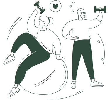
- All sports activities
- Following members
- Activity statistics
- Creating activity
- Joining challenges
Checking in with People to Gather Their Thoughts and Opinions
To deepen our understanding of user preferences, we conducted a brief survey and collected insights from 54 respondents. Below are some key insights:
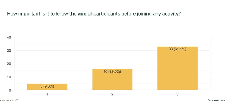
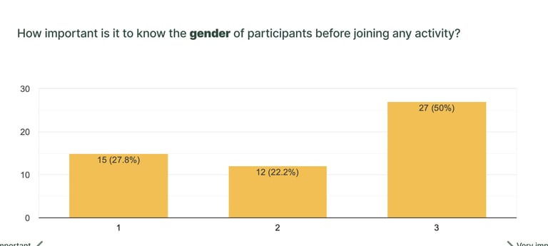
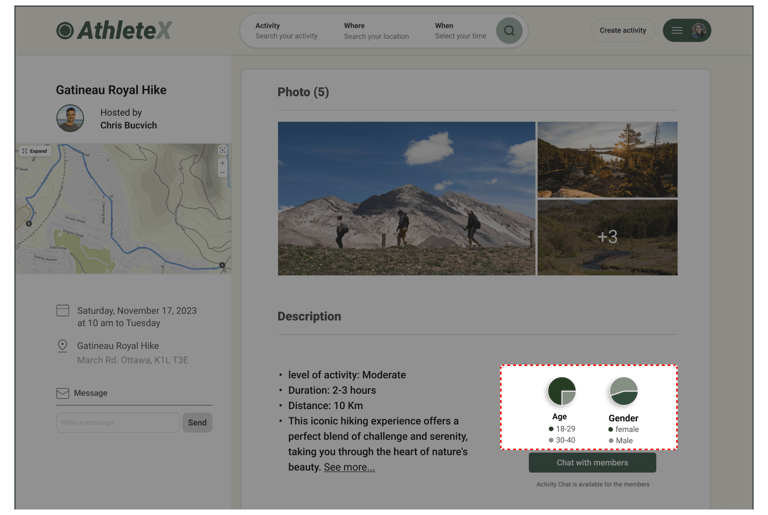
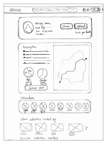
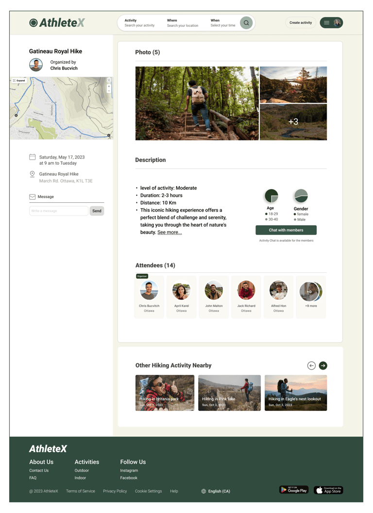
As indicated above, we determined that users expressed a desire to be informed about the age and gender of other attendees in activities. Consequently, we integrated small pie charts within the activity descriptions to provide users with a quick summary of the average age and gender contribution for each activity.
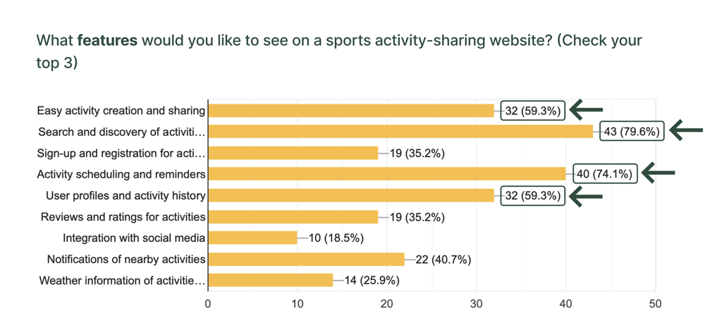
We aimed to address the top demands and preferences of users by implementing key features on the website, including:
- Simplified activity search functionality.
- Integration allowing users to add events to their calendar after attending.
- Capability for users to browse others' profiles and activity history.
- Ability for users to create and share activities with friends.
Next, Following Up with One-on-One Talks to Dive Dipper into Their Thoughts.
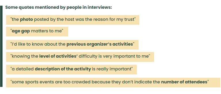
The interviews with 8 people from our survey participants, provided valuable insights emphasizing the importance of providing detailed activities information and developing trust among participants. Specifically, users prioritize access to details such as organizers’ activity history and locations to make informed decisions and feel confident about attending an activity.
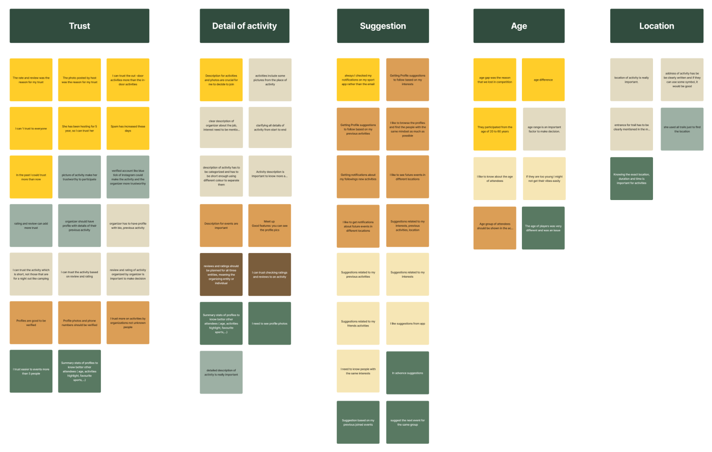
Then, Grouping Feedback to Uncover Common Terms and Patterns.
With creating the affinity diagram, we identified the most important factors to consider.
- Trust
- Detail of activity
- Suggestion
- Age of participants
- Location
Top Takeaways from Our Research
Trust through Information: Users prioritize having comprehensive details about both organizers and activity specifics to feel confident in joining an activity.
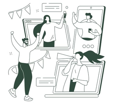
Desire for Social Engagement: Users express interest in having a social network feature integrated into the platform, which would encourage greater engagement among participants.
Simplified Activity Search: Users emphasize the importance of a simplified and comprehensive search function, especially considering the dynamic nature of events being created and deleted by organizers.
DEFINE
Who We Are Designing For?
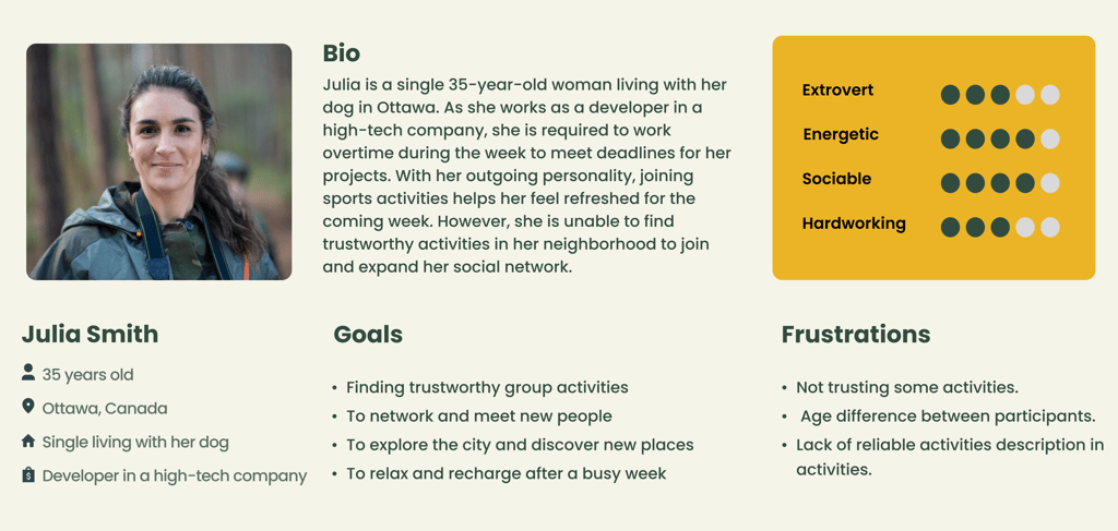
The insights we gained from surveys and interviews leading up to the persona. The main goal is to display those patterns and pain points, which allowed us to further empathize with users.
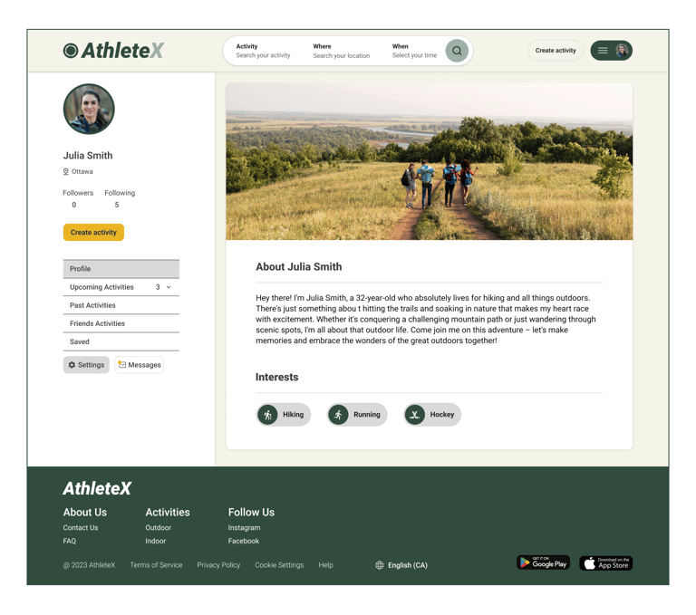
Meet Julia
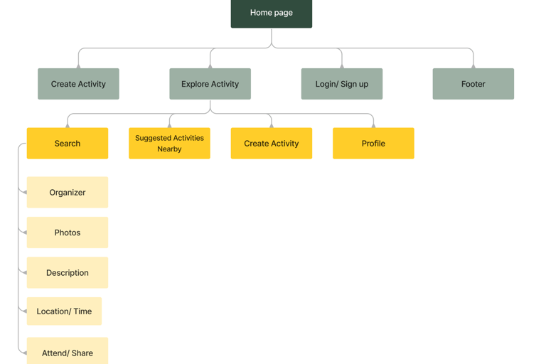
Drawing a Roadmap to Guide How Users will Navigate Our Site
To ensure our information architecture meets user expectations, we conducted six open card sorting sessions using the Optimal Workshop platform. After the initial exercise, we developed our first version and iteratively refined it based on user testing and competitive analysis.
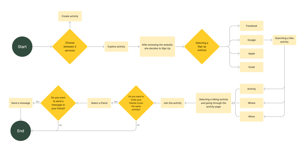
Visualizing the Steps Users Follow to Get From Start to Finish.
In designing the user flow, our aim was to find a hiking activity and then invite a friend.
Creating Tailored Solutions Based on Users' Needs
Challenge:
Enhance user trust to encourage greater participation in activities.
Solutions:
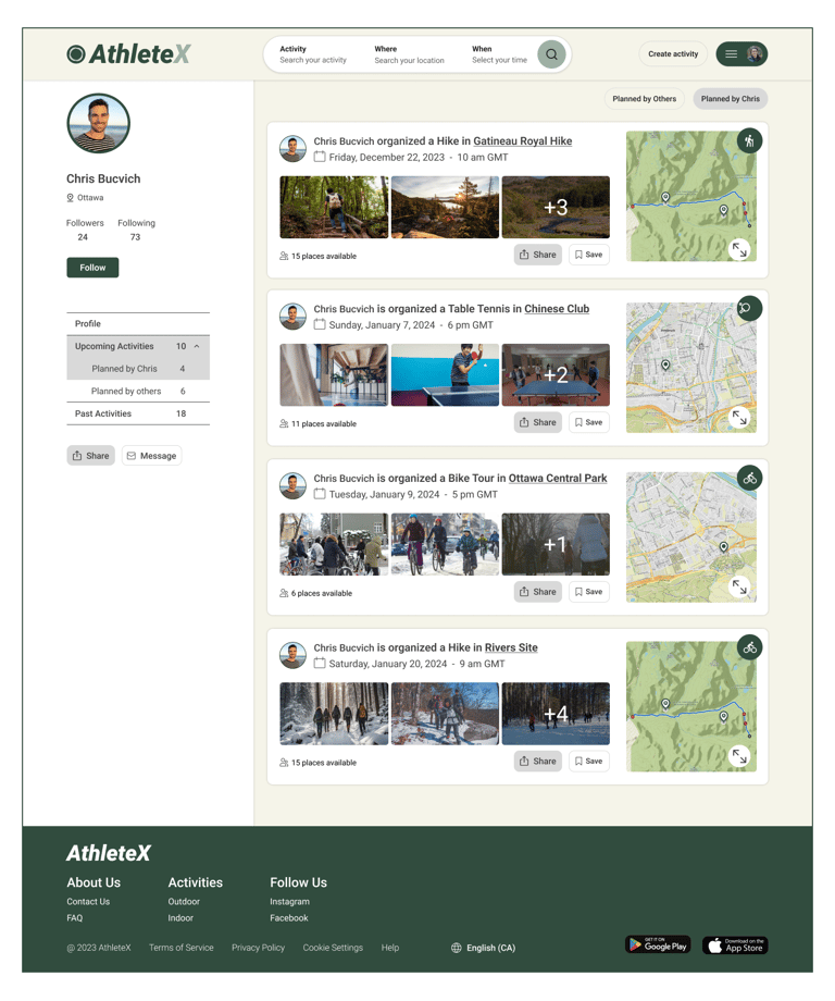
Enable users to easily view profiles, including activity history.
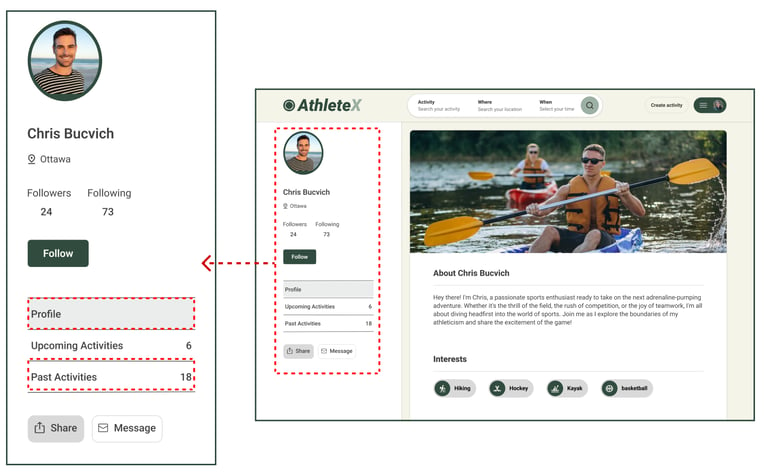
Mention attendee numbers for upcoming activities.
Visualizing Profile Transparency & Social Proof
Challenge:
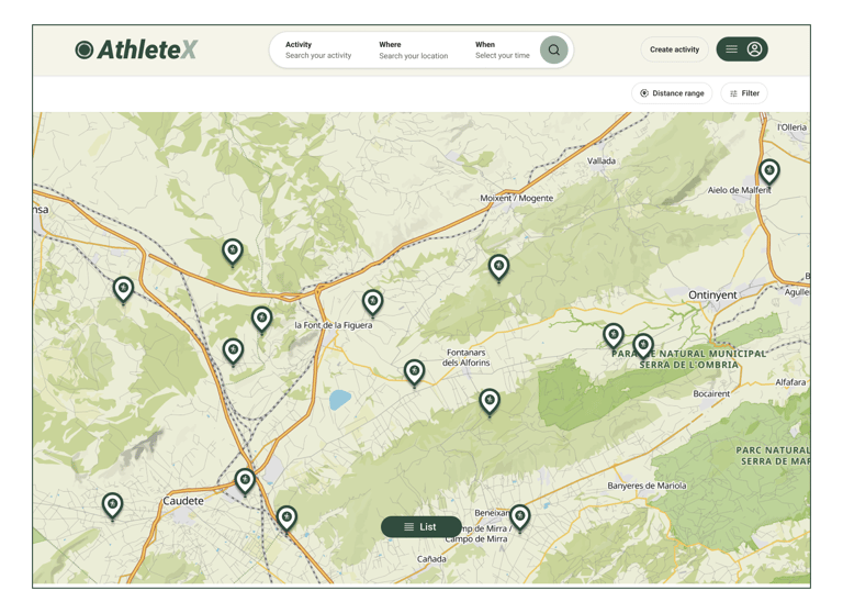
Developing a fast and effective activity search method.
Solution:
We found that "Activity, Location, and Time" are the most useful search criteria for activities. Additionally, users can easily select activities by typing or choosing from diverse categories and regions.
Optimized Search & Category Filters
Challenge:
The extensive list of activities makes it difficult to cover them all thoroughly.
Solution:
Since activities are frequently created and removed, there's no need to list them all. Users can easily search for specific activities using the main search bar.
Optimized Search & Category Filters
Challenge:
Developing User engagements
Solution:
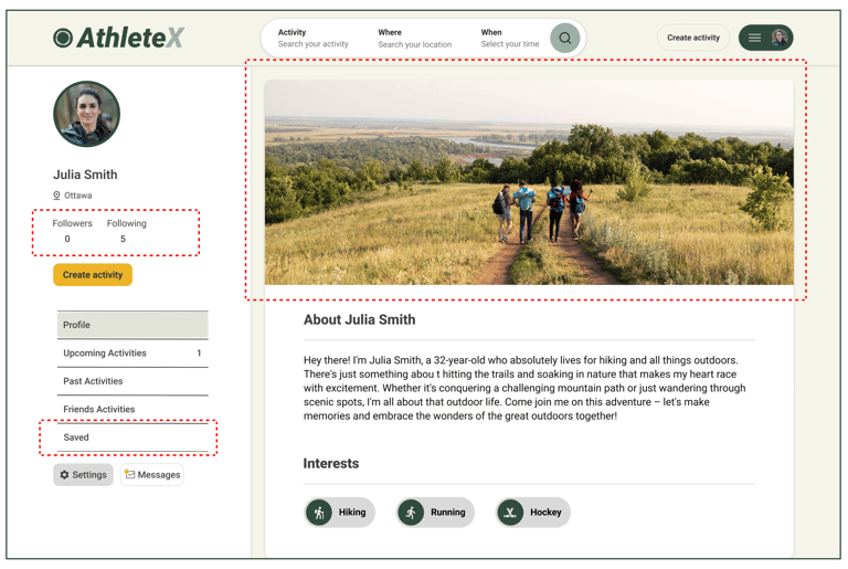
Enable users to personalize their profiles by choosing background images, saving favorite activities, and following friends.
Optimized Search & Category Filters
Challenge:
Demonstrating the age and gender of participants.
Solution:
We added pie charts showing the typical ages and genders of participants to the activities page description.
Optimized Search & Category Filters
Drawing out Ideas to See How the Interface Comes to Life.
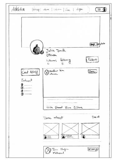
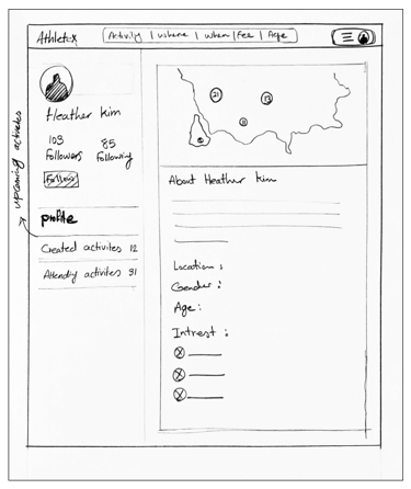
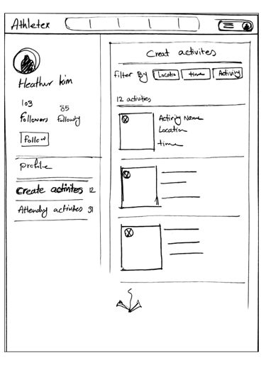
We initially mapped out our ideation using hand-sketched low-fidelity wireframes, aiding communication within the team during the early design stages. Later, we transitioned to creating low-fidelity wireframes on Figma to visualize page layouts and design direction. These wireframes underwent several iterations before final content development.
**Click any sketch to view details
Concept Ideation
Homepage Variations
Search Flow
Tool Details
DELIVER
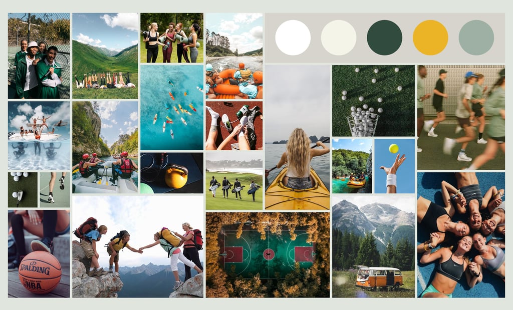
Building an Inspiration Board to Shape Creativity
We were inspired by how group sports activities bring people together, fostering joy and new friendships. We aimed to infuse these positive vibes into our design to motivate users and make them feel more courageous about joining in.
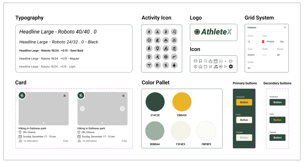
Creating Consistency: A Visual Style Guide for the Product
We developed a complete UI kit to serve as a reference for templates and components. This kit ensures that interface development is smooth, consistent, and efficient throughout the project.
Running Tests and Making Improvements for a Smoother Experience
Throughout the project, we went through multiple iterations, driven by the insights we gained from usability tests. These tests were instrumental in shaping our decisions and constantly enhancing our project.
Home Page
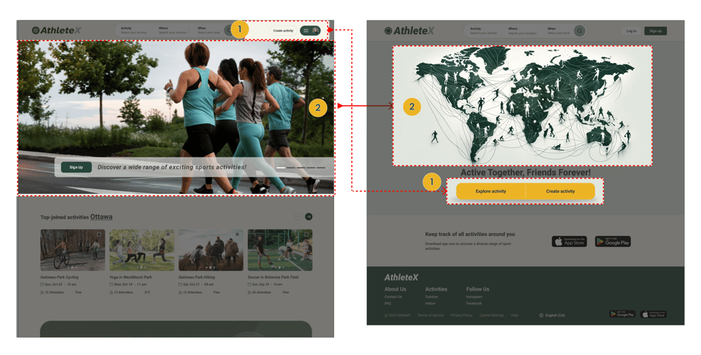
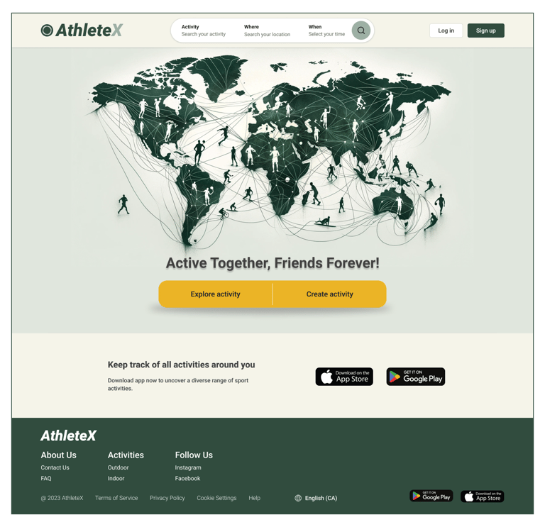
Users found it challenging to grasp AthleteX's 'activity creation' despite its importance as one of the primary service. But now, with these two CTAs, accessing AthleteX's main services is a breeze.
The slideshow photos don't effectively show AthleteX's global functionality to users, but this illustration vividly communicates its worldwide accessibility.
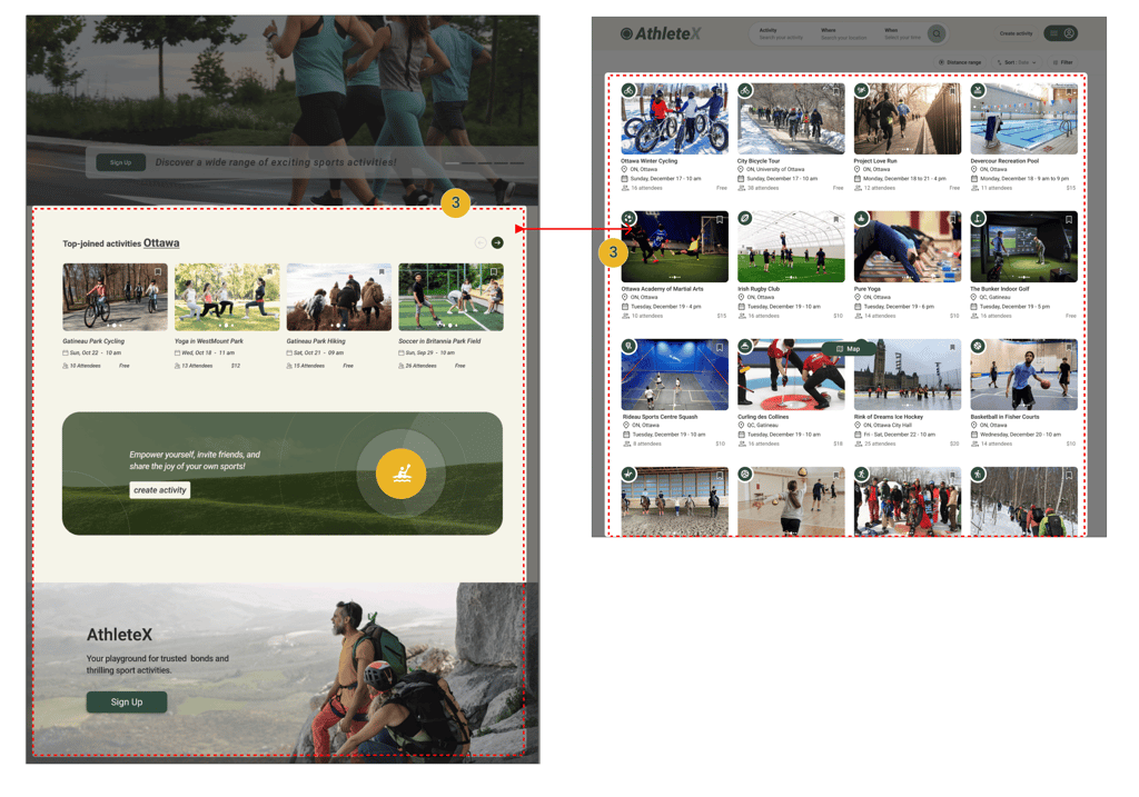
Following usability testing, we acknowledged that the information below the hero image wasn't effectively grabbing users' attention. Consequently, we revamped our homepage. Now, upon logging in or selecting the main services, users will see upcoming activities tailored to their location.
Hosted Activities
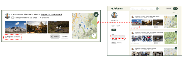
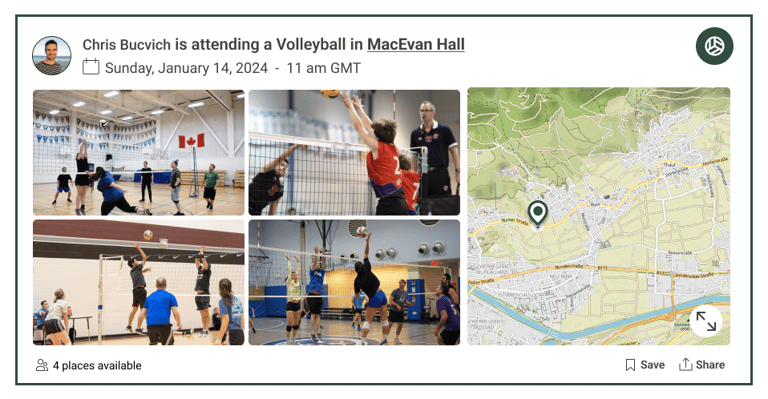
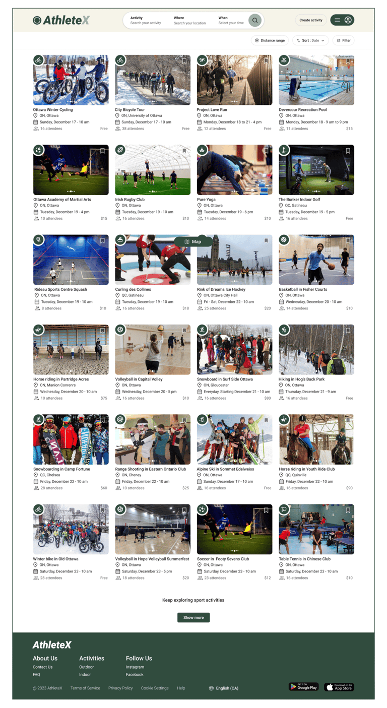
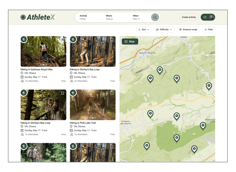
We reduced photo sizes to fit more carts in one scroll and added a map to show the activity's path and location for better info.
Users were confused by the "like and comment" option since the event hadn't occurred yet. We removed it and focused on showing attendee numbers and available spots instead.
Share" and "Save" have been updated to buttons for improved clarity and ease of use.
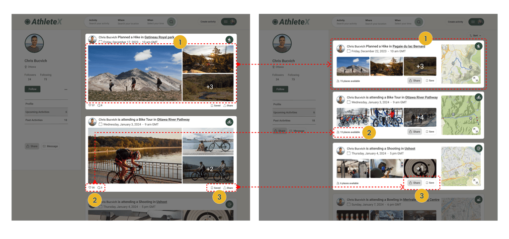
Upcoming Activities
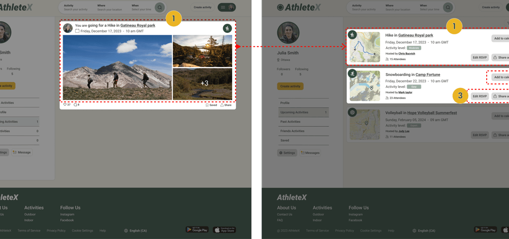
During usability testing, we observed that users were seeking more useful information in the upcoming activities cart beyond primarily viewing photos. So, we revamped the cart design, adding a map, activity date and location, number of attendees, and other details to better meet their needs.
Also included a button for users to add activities they've already joined to their calendar. Additionally, users can easily edit their RSVP and share the activity.
Activity Description
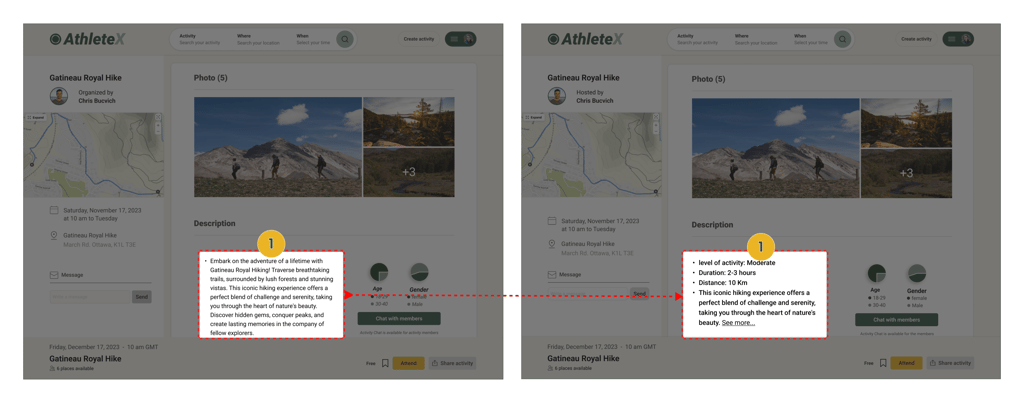
We observed that users struggled with reading long text to find activity information. To help them understand quickly, we transformed the activity description into bullet points, enabling users to grasp details within seconds.
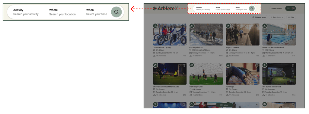
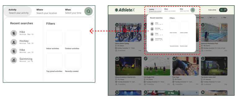
Search Criteria
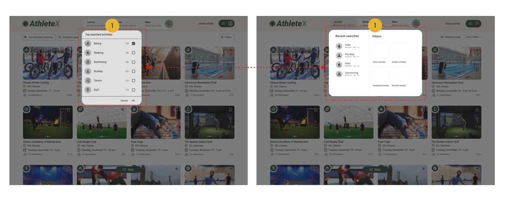
Users were unsure about what "Top-searched activities" meant and why there were numbers next to them. Plus, without a typing indicator, they didn't realize they could search by typing. So, we redesigned the filters. Now, alongside general filters, users can easily search for activities by typing activities name, with the help of a typing indicator.
Trying out Different Versions to Find the Best Fit - A/B Testing
During testing with 13 users, the majority expressed a preference for Frame B. This version features smaller event photos, resulting in a smaller cart size and allowing for more carts to be displayed in one scroll. Additionally, it includes a larger map and more prominent share and save buttons.

Delivered Design Pages
Home Page
Home Page
Search Results
Activity Description
Upcoming Activities
Profile
Extended Map
Click an image to enlarge • Swipe to see more →
This Journey Taught Me ...
Reflecting on this project, it was a great learning opportunity for me as a UX designer. Working with a stakeholder and a team of designers taught me the importance of collaboration, communication, and flexibility. I learned to approach design decisions with a balance of user feedback and business goals, and to iterate designs based on ongoing feedback. Moving forward, I will continue to build on these skills and apply them to future projects.
Next Step
If I was to continue working on this project, my next step would be finalizing the mobile version of the platform and evaluating current designs through more user experience testing.